Table of Contents
Whether you’re a fan of functionality or happened to attend the University of Miami (affectionately known as “The U”), opting for a u-shaped kitchen design is likely something you’d find great value in. Ultimately, the u-shaped design is one that exists to maximize space while also providing a sense of ergonomic comfort to those whipping up meals in it.
What is a U-Shaped Kitchen?
A U-Shaped Kitchen is a kitchen that is in a horseshoe shape and maximizes the amount of space in the area. U-Shaped kitchens are ideal for smaller homes.
A well-designed u-shaped kitchen will essentially make it easier to go from the stovetop to the sink to the cutting board by simply turning around. A perfectly designed u-shaped kitchen will also make it so the refrigerator is within arm’s reach as well, but depending on available counter space, being able to reach the fridge by turning around is not as important as being able to reach the stove, sink, or prep area.
[get_quote]
U-Shaped Designs
Nevertheless, let’s explore a variety of u-shaped designs to get a sense of the options available.
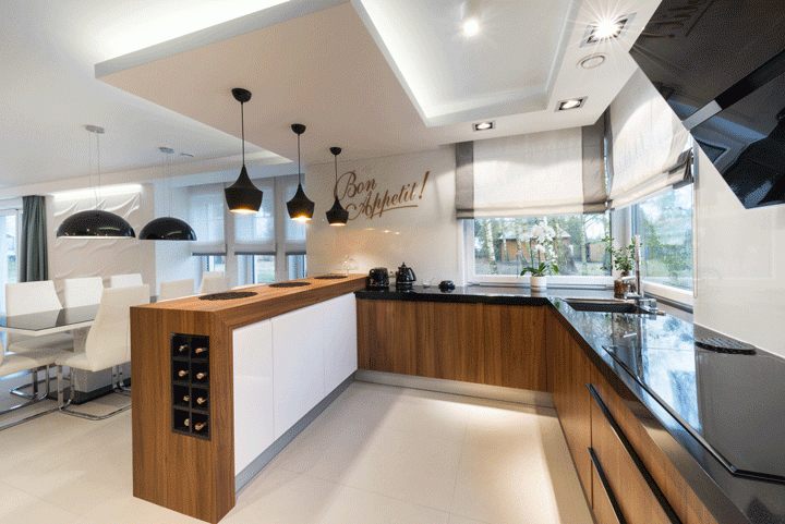
What sticks out most regarding the version of the u-shaped design above is the mixed use of different materials to provide a sharp yet simple contrast to the predominantly white walls. The wood grain waterfall countertop on the peninsula and for the cabinets provides a warm yet modern feel to the kitchen. Additionally, the positioning of the sink and counters near windows is a crucial design choice as it relates to u-shaped kitchens. Since the u-shape design can feel cramped, natural light as well as lighter color choices can help prevent the kitchen from feeling claustrophobic.
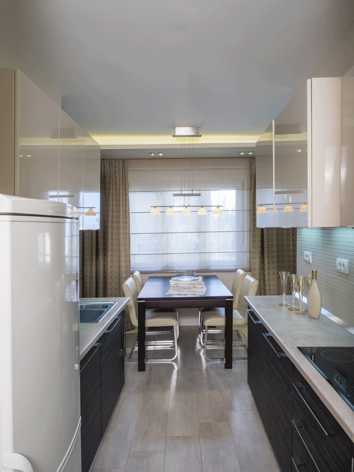
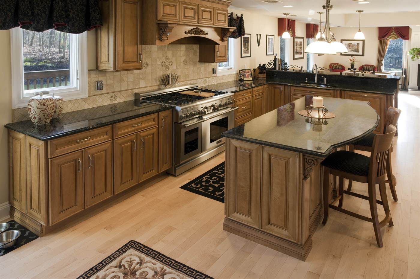
One of the primary reasons for utilizing a u-shape kitchen design is to maximize space. While the first example seems to be done out of preference and not a lack of space, the above example is done purely for efficiency’s sake. This kitchen offers up a simple and clean design, as well as easy access to the fridge, stove, and sink, without having to take more than a step in either direction. This is a pragmatic design choice built around the limitations of the space, but even then, they manage to add touches of class with textured black cabinets and stone countertops. So this example manages to demonstrate, quite perfectly, the traditional usage of a u-shaped kitchen design as it takes a small space and makes it functional and classy.
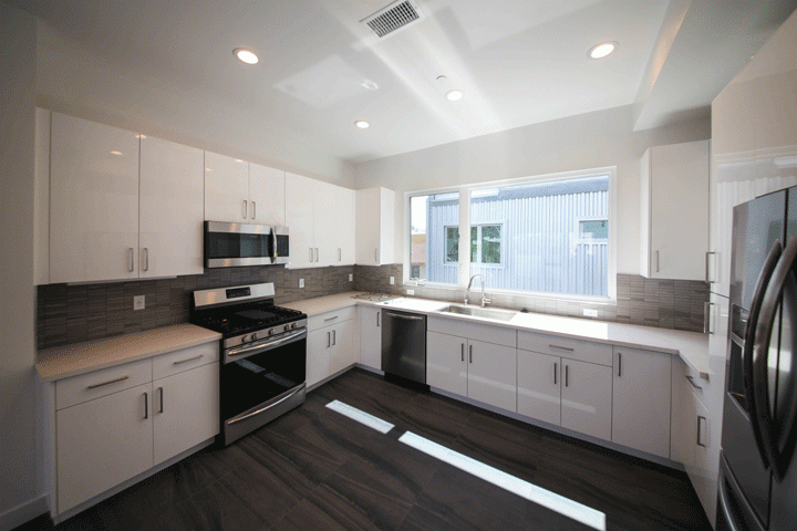
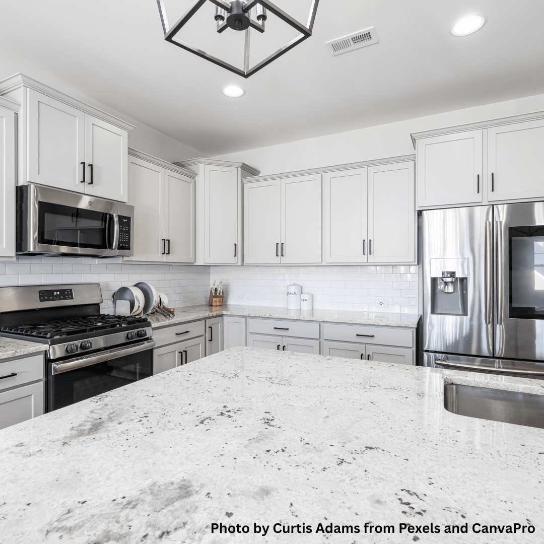
The above example of a u-shaped kitchen certainly falls under the minimalist category of interior design. With the exception of the backsplash and the black appliances, this homeowner opted for that clean white look with accents. They also neglected the narrower u-shape design for a more open one. This design option is good if you tend to have people in the kitchen constantly and must ensure there is space to move around them. Otherwise a small-to-medium island would genuinely fill out the space and make it feel complete. That said, note the big window right over the sink, which serves as great source of natural light to make this wider u-shape design feel even more open.
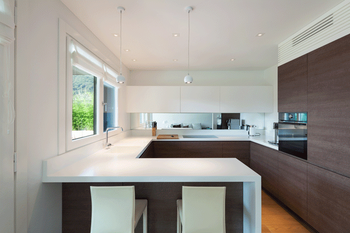
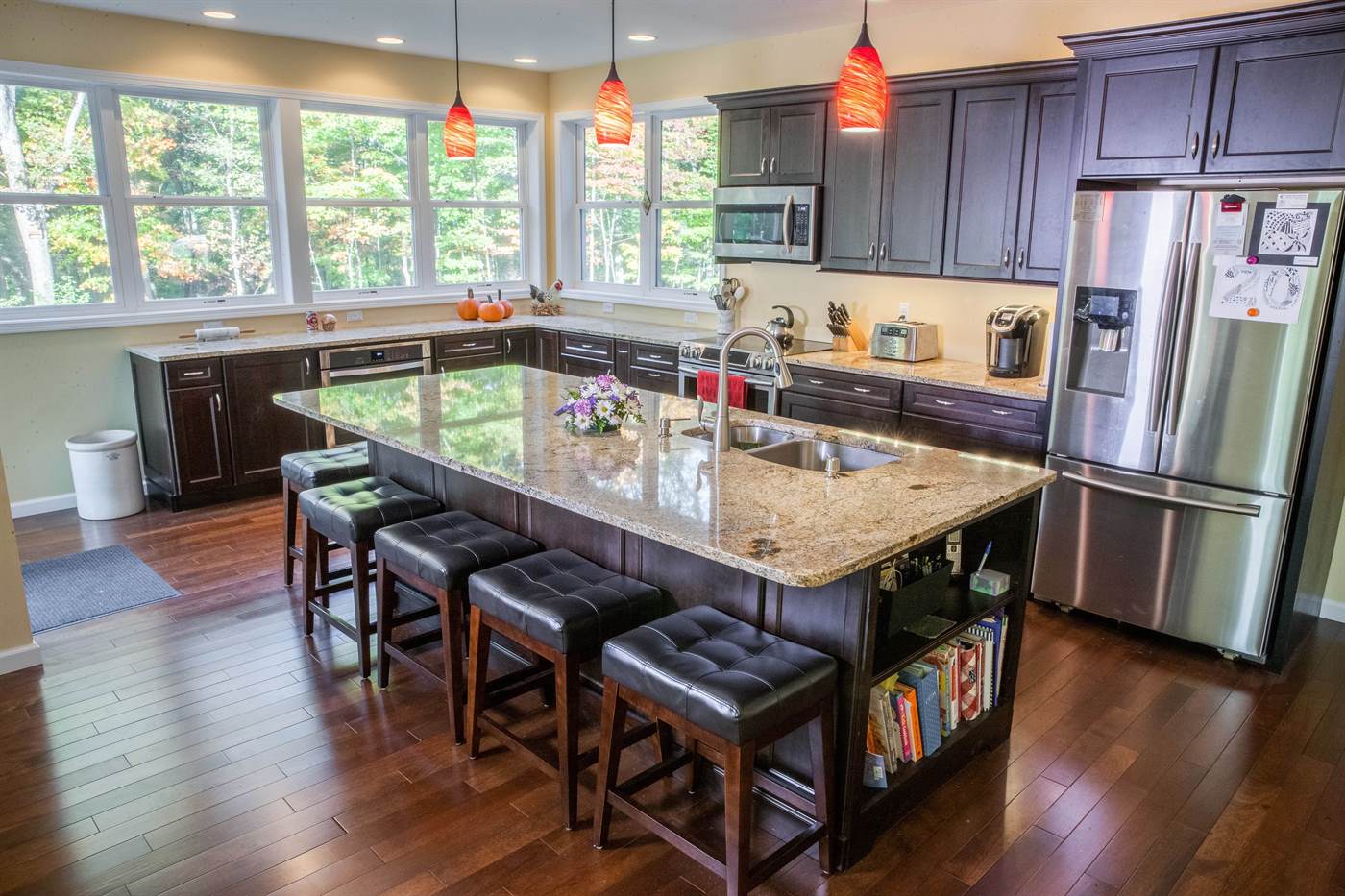
Unlike the previous example, this version of a u-shaped kitchen offers you some protection from the nosey members of the household who like to meander into the kitchen while you’re trying to work. Instead of leaving the space open, add an area like the seated one above that will act as a natural barrier between the rest of the house and the kitchen. This will ensure that those lured in by the inviting smells will avoid encroaching on the personal space of whoever is cooking, allowing for food to be prepared without anyone (except the cook) hovering over it.
As for aesthetic choices, dark wood and white provide a complementary balance to one another, offering up yet another minimalistic design that again utilizes a combination of natural light and white to make the space feel more open than it actually is.
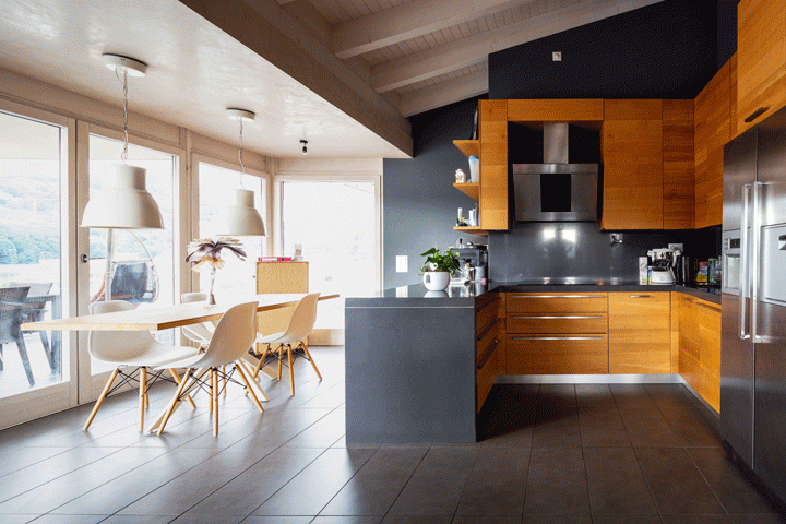
Now this final example of u-shaped kitchen design simultaneously breaks the rules and follows them. Note the dark cabinets accented by a lighter wood grain on the doors. The stainless steel accenting via the cabinet handles and refrigerator also help make everything pop while also pushing the black furnishings to the background, at least from a perception standpoint.
[get_quote]
That said, without the patio doors that act as a major source of natural light, this design aesthetic might not look as sharp and comforting as it does. This design, as a whole, manages to utilize the entire space brilliantly, breaking the lighter color only rule, and adding a depth and sense of character to the kitchen that is lacking from previous examples.
And ultimately the reason why this u-shape kitchen design stands out above the others is because whoever designed it understood the various home design and lighting dynamics at play. They knew the room offered up more natural light than most kitchens and used that to incorporate darker design elements to provide a greater sense of balance and warmth to the room. Additionally, the stainless steel accents help reflect some of the light coming in while the black counters and walls help absorb any excess light.
In the end, when it comes to home renovation projects it’s good to explore all of the available options and to seek inspiration from a myriad of resources, but the goal is to end up with something that is both well-executed and a reflection of personal style. Remember, as we saw from the final u-shaped kitchen, home design rules can be broken so long as you know what to look for and how to make the unconventional work for your space.
images courtesy of Shutterstock


 The article helped me immensely
 I’m now more informed on the subject
 I have questions about Marble.com
 The article was not accurate at all
 There is a serious lack of information
 I have questions about Marble.com